A complete guide to kitchen planning
This article and the related video are your comprehensive guide to creating a professional kitchen layout. Whether renovating an existing kitchen or constructing a new one, having a well-thought-out layout is essential for developing a functional, comfortable, and stylish environment.
The kitchen is often the heart of the home, where cooking and gathering come together. A thoughtful layout boosts both functionality and flow, making the space more enjoyable to use. From ancient times to today, essential elements of the kitchen remain the same: a water source, prep surface, heat source, and storage. When designing, focus on workflow, ergonomics, and efficient space use to create a practical and welcoming kitchen.
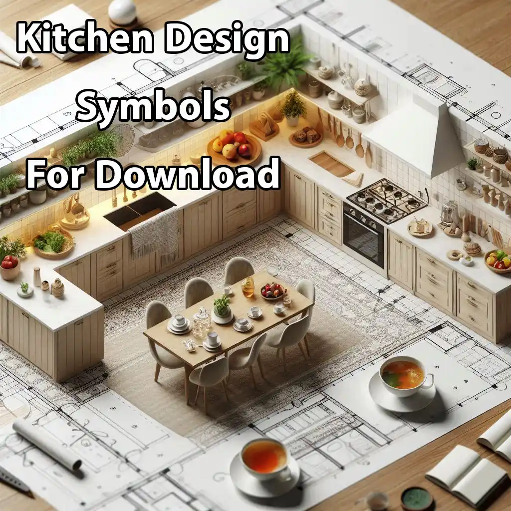
Table of contents
What is a kitchen layout?
A kitchen layout is the planning and arrangement of key elements in the kitchen, such as the counter, sink, stove, refrigerator, appliances, cabinetry, and storage. The layout determines how these elements are positioned in relation to each other. This affects not only functionality but also the work process and The beauty of the space.
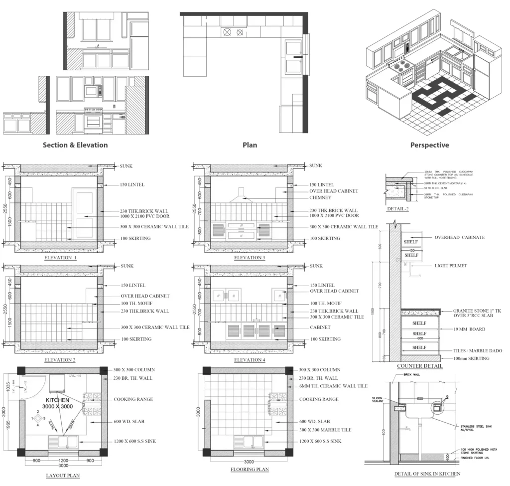
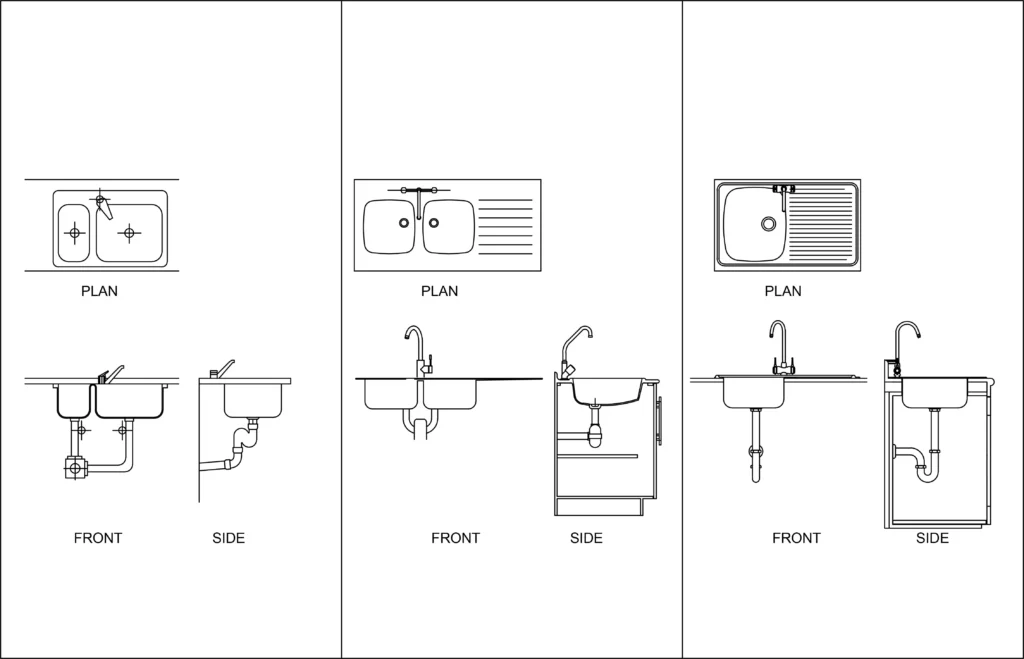
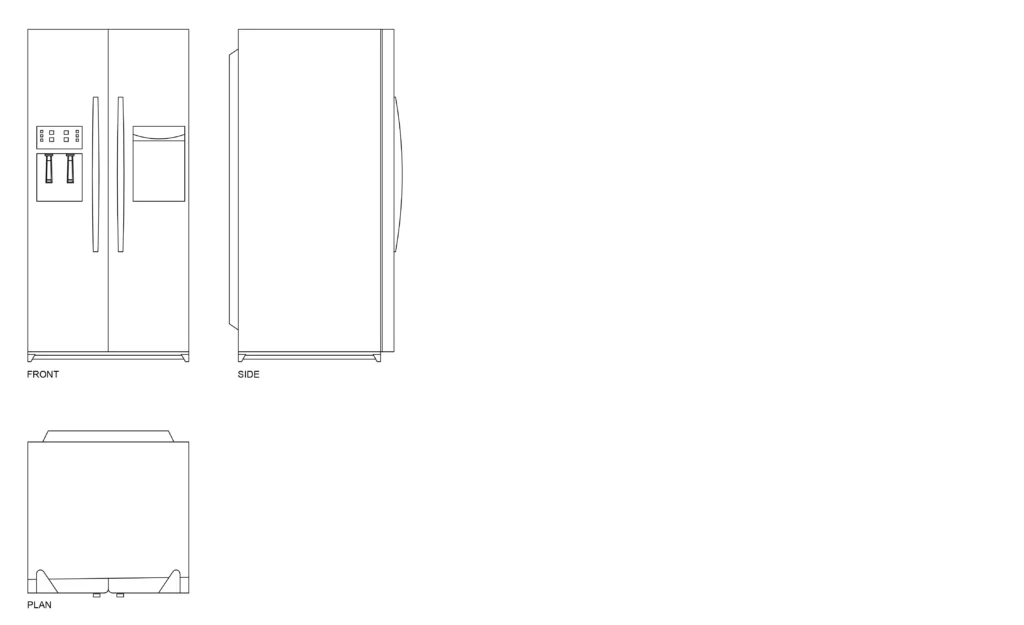
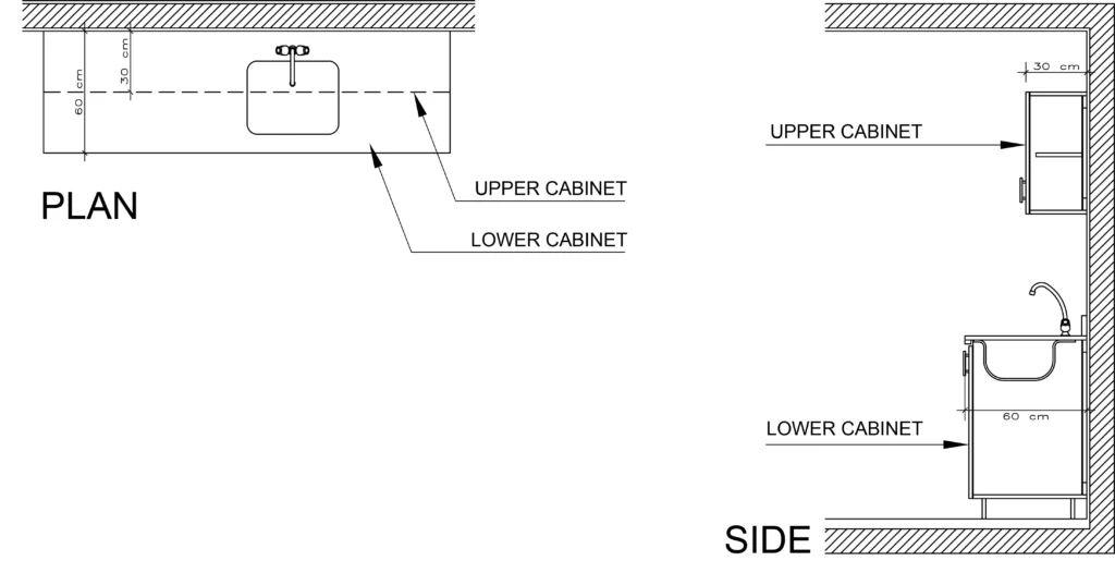
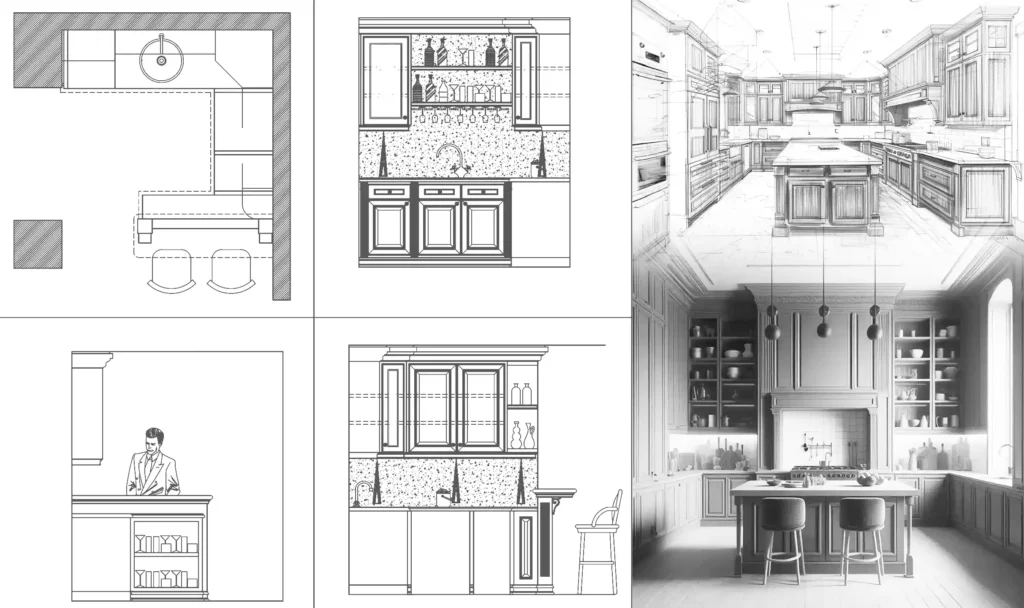
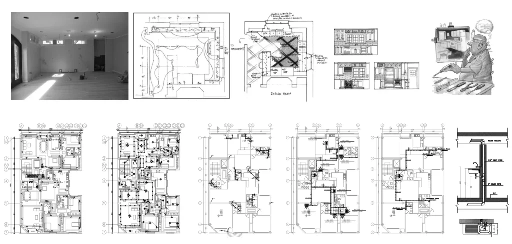
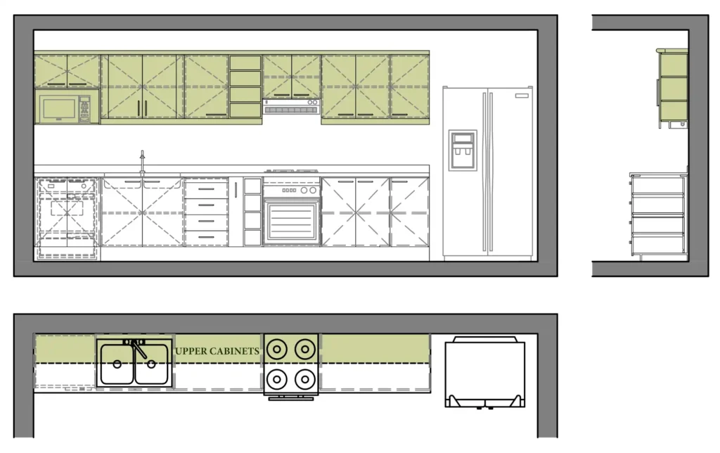
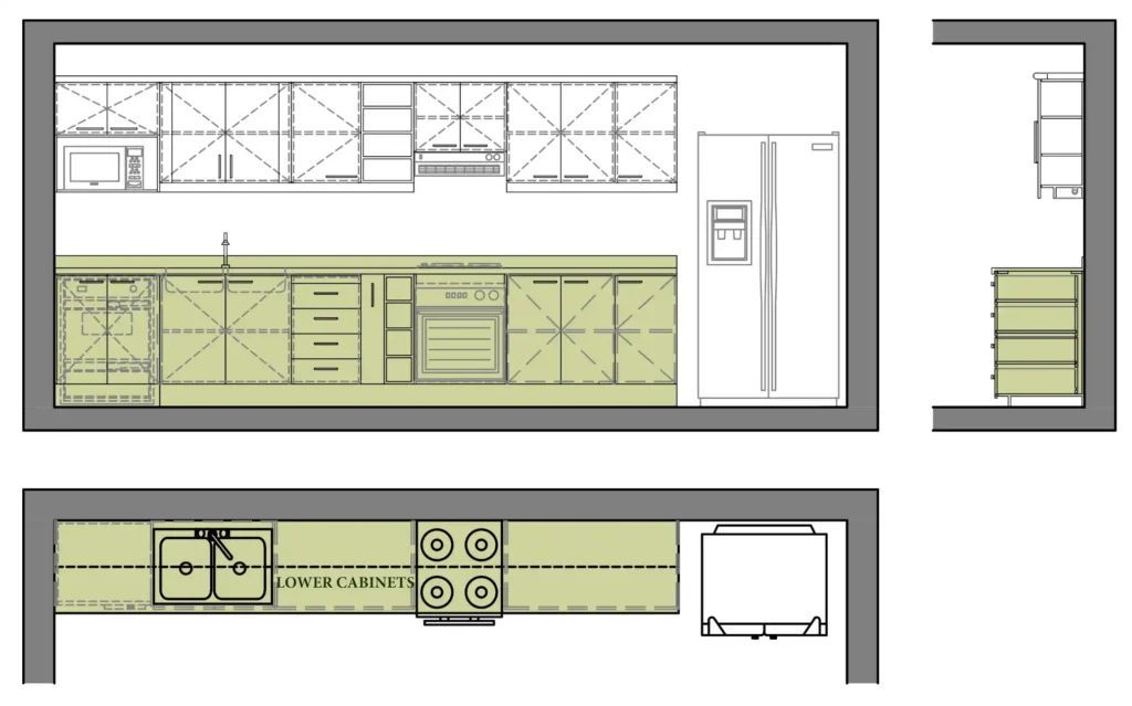
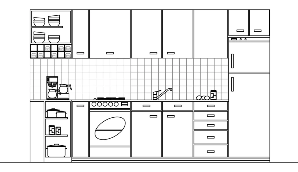
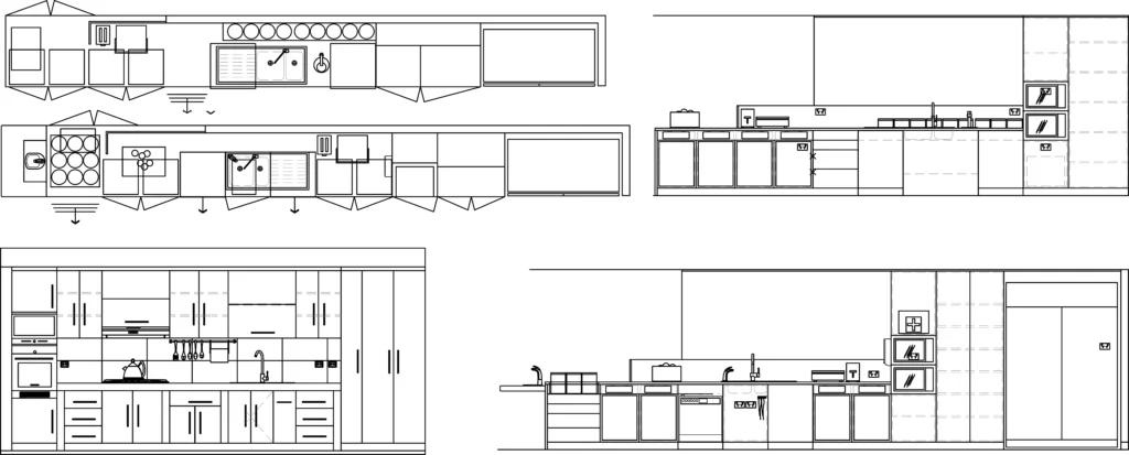
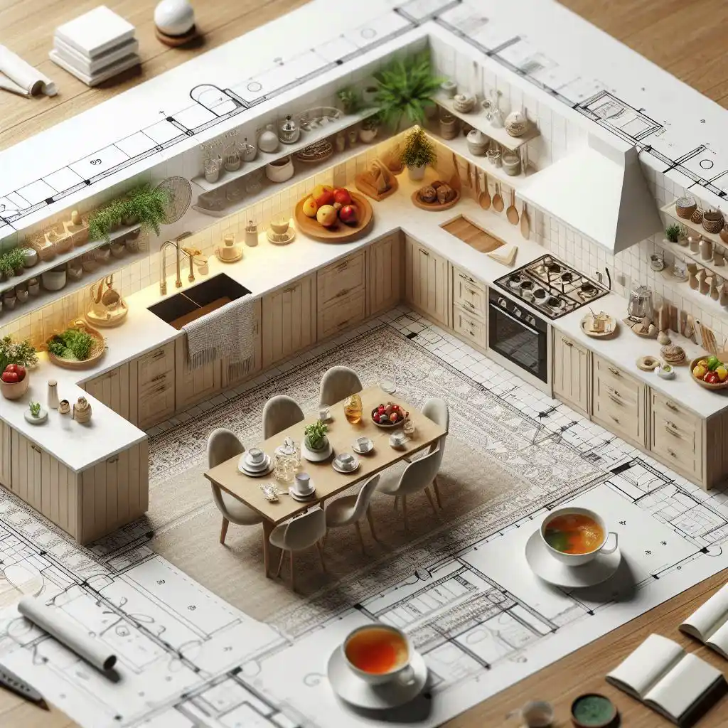
From an architectural point of view, The layout of a kitchen is often visualized through drawings such as plans (top views), sections, and elevations.
- The plan shows the top view, Revealing the arrangement of various kitchen elements and their relationship.
- Section and elevation drawings provide side or front views. It helps you understand the vertical alignment and elevation of countertops, cabinets, and appliances.
Each of these drawings can include important details that indicate the dimensions, material options, and manufacturing techniques to ensure that designs not only look good but are also effective in real use.
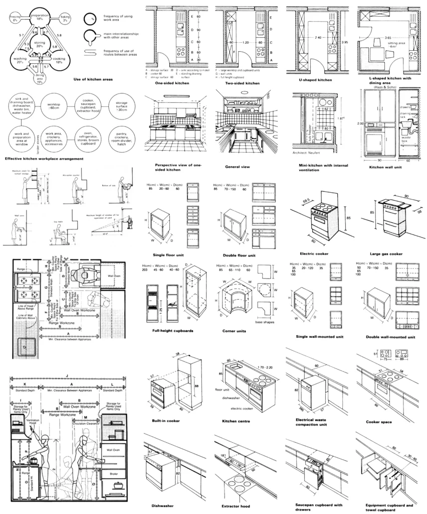
Drawings and Symbols for the Kitchen Layout
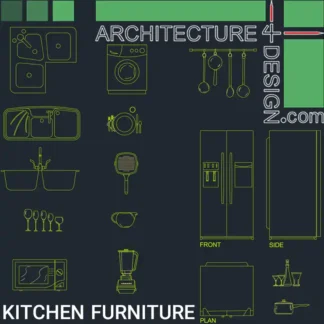
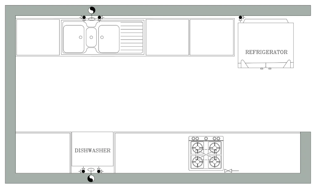
Symbols are the language of technical drawings, allowing us to convey various kitchen elements without needing to sketch them out every time.
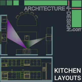
Download kitchen layout symbols and various kitchen design samples from this link.
Here are some common symbols you’ll encounter in kitchen layout design:
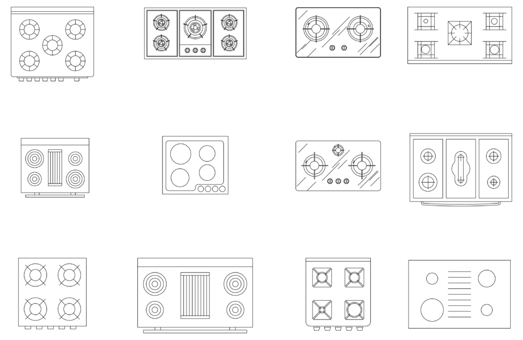
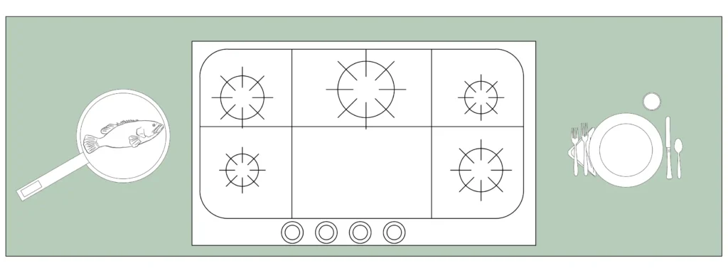
- Stove symbol: This indicates the location of your cooktop or range. Ensure there are nearby surfaces for placing hot pans or dishes.
for gas stoves, The symbol typically includes burners or circular shapes with small dashes indicating flame areas. These stoves may also feature a small gas pipe symbol connecting to the kitchen’s gas supply.
On the other hand, electric stoves are often depicted with smooth, rounded circles representing heating elements without flame indicators. Some symbols include plug marks to distinguish them from gas stoves.
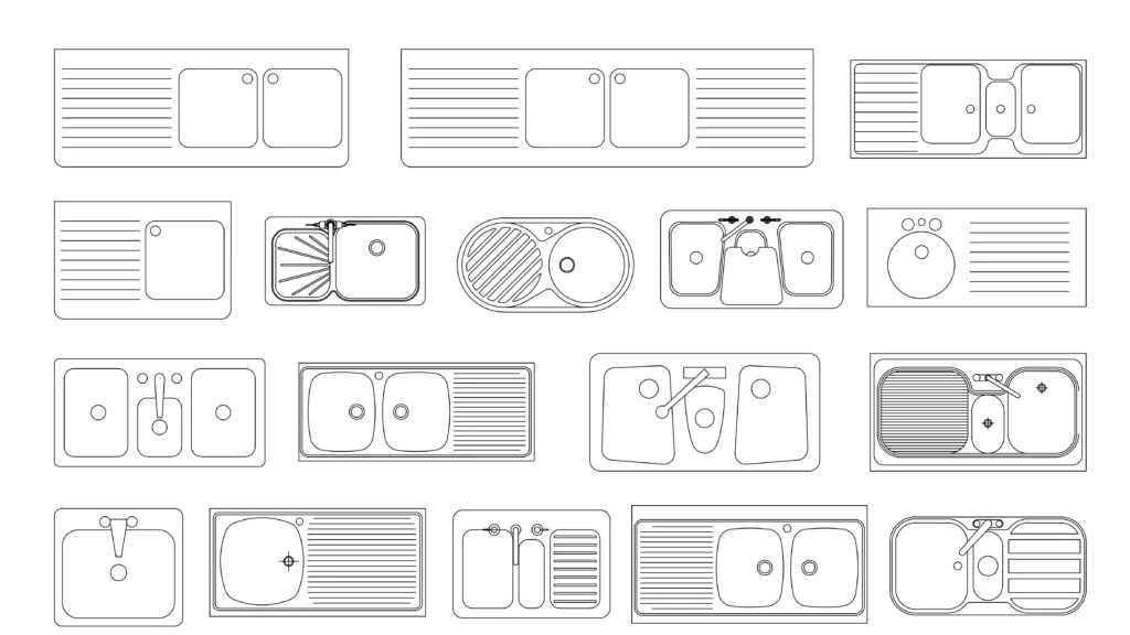
- Sink symbol: It is usually a rectangle with a line through the center. Some prefer a double sink, while others opt for a single, larger basin.
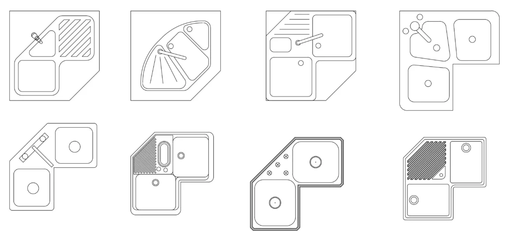
Corner sink symbols can be represented with a triangle or L-shape, indicating their unique placement in kitchen layouts. The placement of the sink is a critical consideration in kitchen layout design, as it significantly impacts functionality, workflow, and overall efficiency.
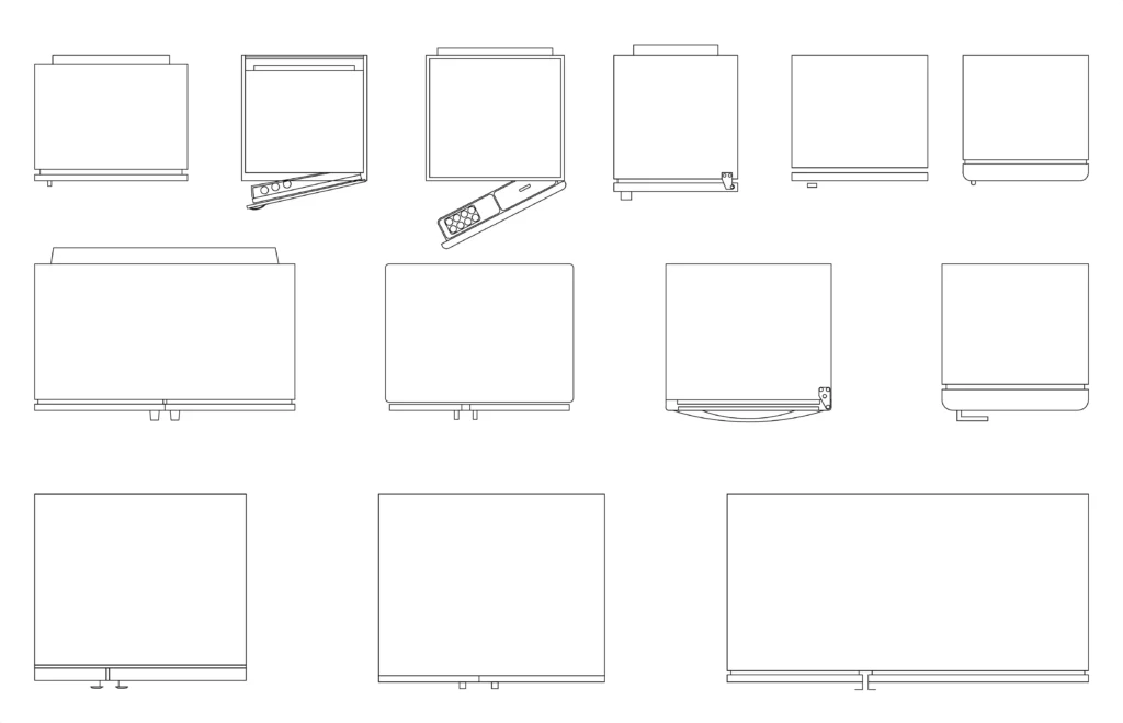
- Refrigerator symbol: A large rectangle representing the fridge’s location. Every kitchen needs refrigeration, whether as a standalone unit or under-counter drawers.
Position the refrigerator near the kitchen entrance for easy access while ensuring it doesn’t disrupt the main cooking area or block traffic flow.
- Cabinet symbols: Lines and shapes depict upper and lower cabinets. Prioritize efficient storage, accessibility, quality materials, a layout that complements workflow, and finishes that enhance the overall look.
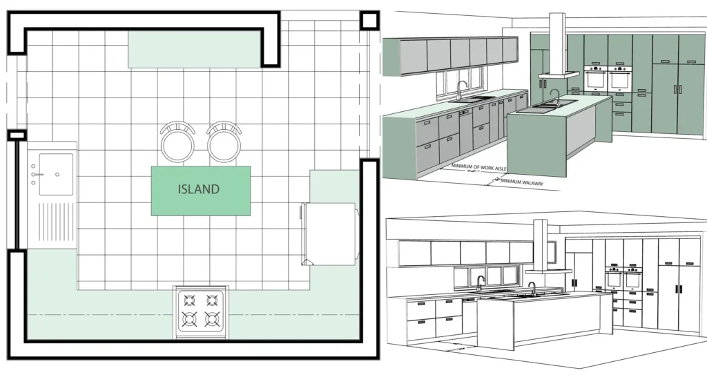
- Island symbol: Typically shown as a large rectangle in the middle of the layout.
For a functional island, consider adequate workspace, storage, appropriate dimensions for movement flow, and integrating seating if desired. Select materials that match the kitchen’s style and durability needs.
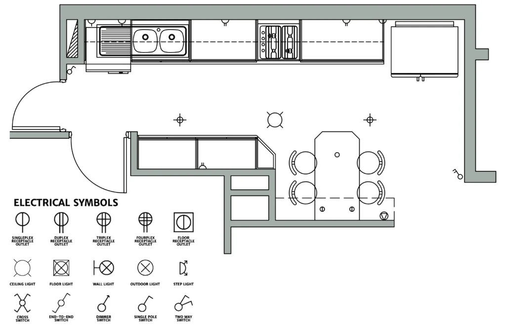
- Electrical outlets and lighting symbols are essential for indicating where power is needed for appliances and where light fixtures will be installed.
- Plumbing and Infrastructure Symbols: These symbols depict sinks, dishwashers, gas lines, water supply, and waste disposal. Their accurate placement is crucial for optimal functionality.
These symbols are significant in renovations as they indicate the location of existing fixtures and systems, helping plan for water supply, waste disposal, and gas connections. For new designs, after the layout is finalized, engineers will handle these systems. Properly marking these symbols ensures a smooth and efficient kitchen layout, regardless of the project’s scope.
Key Questions for Kitchen Design
Before designing your kitchen, consider these questions to address functionality, user needs, and design preferences:
- Who will be the primary cook? Are there children or household staff to consider?
- Will two people be cooking at once?
- How often do you use the kitchen? Is a social space or a small, functional area needed?
- Are there religious or cultural considerations affecting the layout or appliances?
- Does the kitchen need to be accessible for disabilities or aging in place?
- Will meals be eaten in the kitchen? Are other activities planned, like homework?
- Do you have pets that need space in the kitchen?
- What level of maintenance is acceptable for materials and finishes?
- Should windows have curtains or shades, and will cabinetry and molding accommodate them?
- Should the kitchen be open or closed off?
- Is a separate pantry needed for storage?
- Are there specific appliances required for your cooking style or dietary needs?
- Is special storage needed for small appliances?
- How important are recycling and composting, and should bins be integrated?
Designing the Kitchen Layout
When designing a kitchen, it’s important to consider how the layout will affect the space’s functionality and flow. A well-planned kitchen layout can significantly affect how efficiently you move between cooking, cleaning, and storing items. By selecting the proper layout for your space, you’ll create an environment that’s not only visually appealing but also practical and comfortable for everyday use. Let’s get started by exploring how to determine the best shape for your kitchen.
Step 1: Determine the Kitchen Shape
Kitchens come in various shapes and sizes, but most follow a few common layouts:
U-shaped
This layout features three walls of cabinets and appliances, forming a “U” shape. It’s ideal for larger kitchens or homes with open floor plans, offering ample storage and counter space.
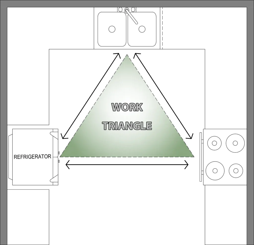
A U-shaped kitchen features a workstation on each of the three walls, creating an efficient work triangle that minimizes movement for the primary cook. This layout allows for easy transitions between tasks with just a quick turn. In larger kitchens, a second person can also work simultaneously by sharing part of the workspace. For optimal functionality, the base of the U should be at least 8 feet long. Typically, the sink is placed at the base, while the range and refrigerator are positioned on opposite walls, but these placements can be customized based on personal preference.
L-shaped
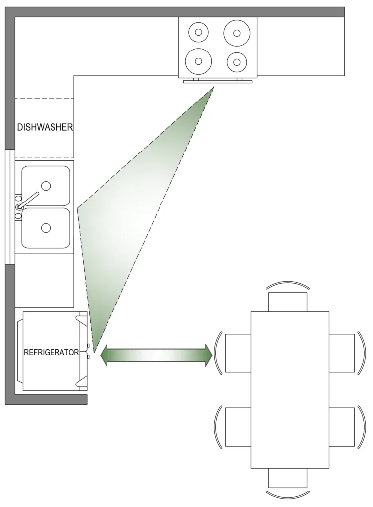
Two adjacent walls form the “L” shape, providing a more open layout that works well in smaller spaces or as part of an open-concept design. It maximizes corner space and allows for a more efficient work triangle.
L-shaped layouts position two workstations along one wall and a third on the adjacent wall. This design is ideal for rooms that are 10×10 feet or larger, allowing traffic to flow smoothly around the corner of the L. Arrange appliances and fixtures based on your cooking style; for added convenience, try placing the refrigerator near the dining area, allowing guests to grab drinks without getting in the cook’s way.
Galley
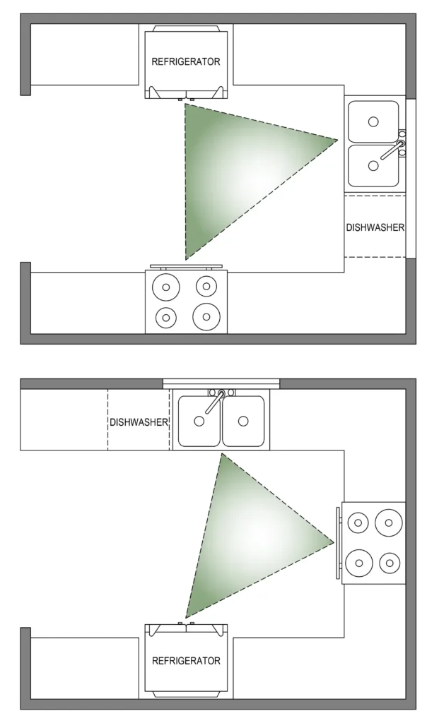
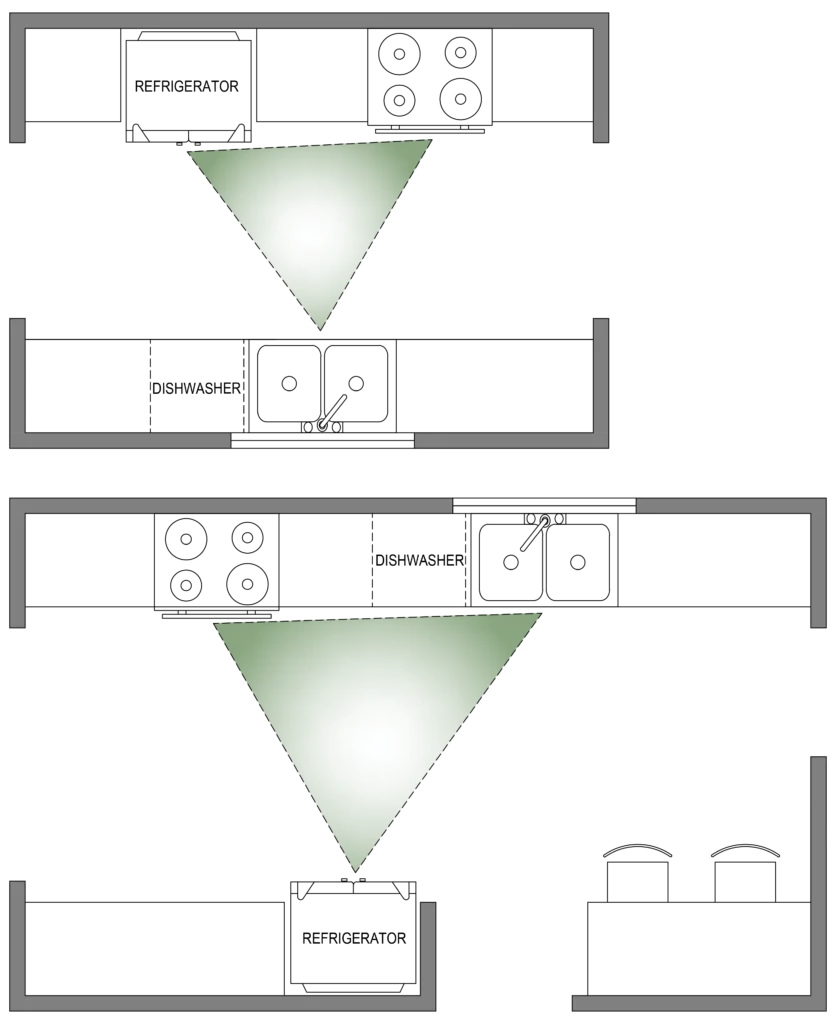
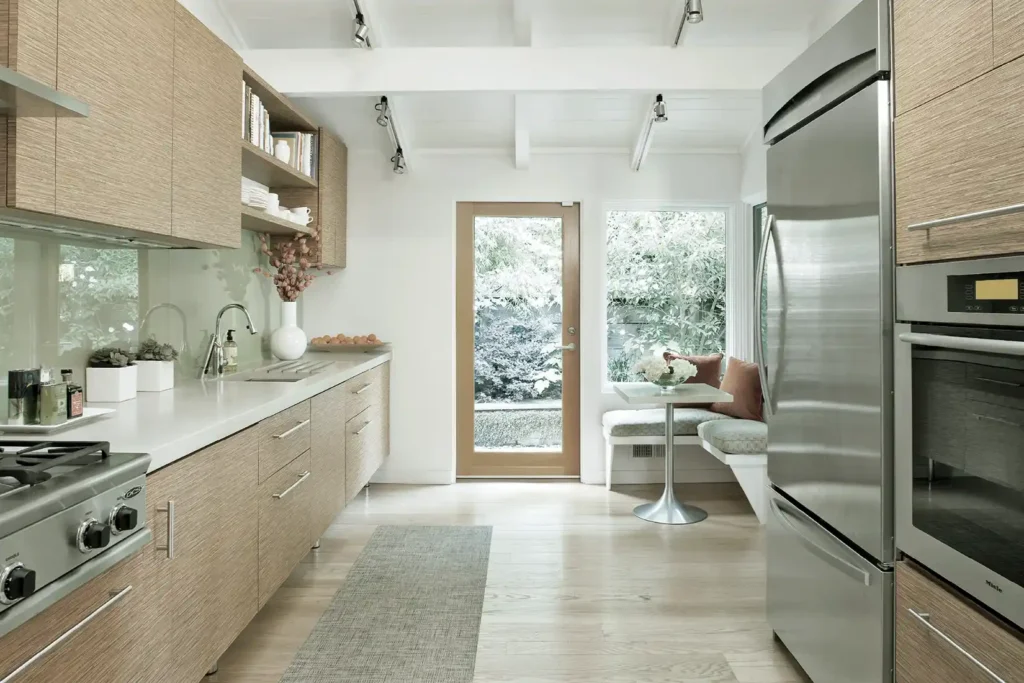
Also known as corridor kitchens, galley kitchens have two parallel walls with countertops and appliances. This layout is common in smaller, narrower spaces and is great for maximizing efficiency and storage.
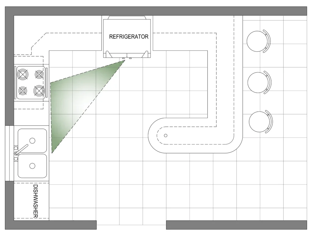
This layout’s efficient design reduces the number of steps needed when preparing meals. To create a practical work triangle, place two points on one wall and the third on the opposite wall. Often, positioning the sink and refrigerator together on one side with the cooktop on the other works best.
Ensure the aisle is at least 4 feet wide for better traffic flow, especially if more than one person is cooking.
Opt for light wood tones and paint colors to make a galley kitchen feel more spacious. Features like open shelving, glass-front cabinets, and large windows can also help reduce the sense of being boxed in.
Single-wall
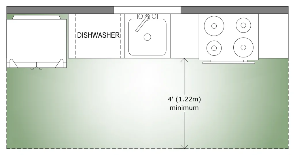
As the name suggests, this layout features all cabinets, countertops, and appliances along one wall. It’s often found in smaller homes or apartments and is perfect for saving space while still being functional.
In this layout, position the sink between the refrigerator and cooktop, ensuring plenty of counter space on both sides for meal prep and cleanup.
Island
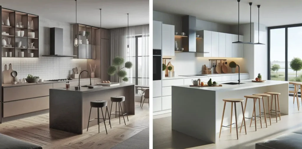
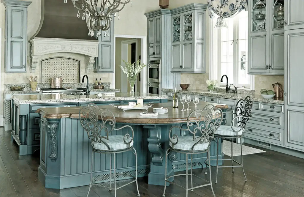
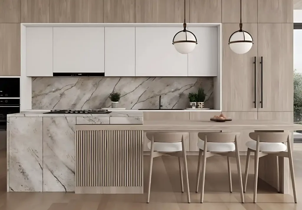
An island layout incorporates a freestanding counter or workspace in the center of the kitchen. It adds extra prep area, storage, and often seating, and works well in larger kitchens or open floor plans.
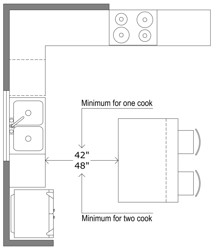
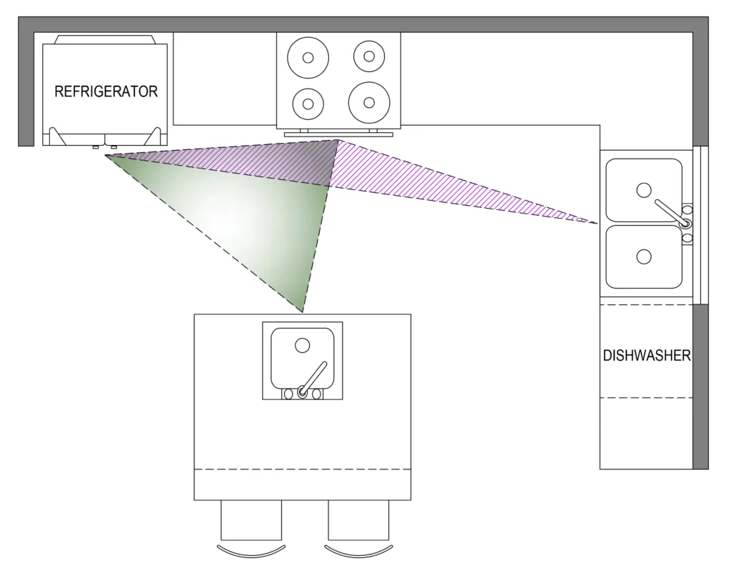
Adding an island makes it easier for multiple cooks to work together, mainly if it includes a cooktop or secondary sink to create multiple work triangles. For this layout, workstations should be placed on adjacent walls to avoid the need to navigate around the island constantly. Ensure at least 42 inches of clearance on all sides of the island (or 48 inches for two cooks) to maintain smooth traffic flow.
Incorporating a prep sink or cooktop into the island allows you to establish two overlapping work triangles, making kitchen tasks more efficient. Extending the countertop also provides a versatile space for casual dining, supervising homework, or seating guests during gatherings.
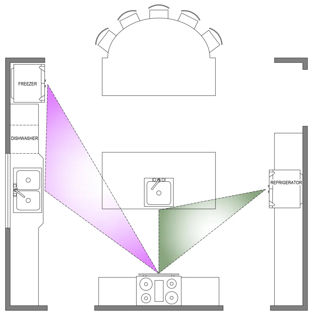
If you’re planning an extra-large kitchen for entertaining or cooking for a crowd, consider adding two islands. Unlike a single large island that can hinder traffic flow, two islands can save steps and time. Including a sink, cooktop, or refrigerator drawers in one island forms a compact work triangle with the main appliances on the perimeter. This setup also supports overlapping work triangles, making it easier for multiple cooks to work together. Designating one island for casual dining keeps guests nearby but out of the way while offering an excellent spot for homework or buffet-style serving.
Peninsula
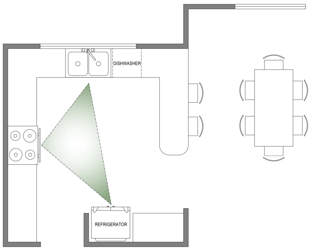
The peninsula extends into the room like an island but is attached to one wall or counter. It provides additional workspace and storage while helping to define the kitchen space in an open-concept design.
Opting for rounded corners on peninsulas and kitchen islands is a practical design decision to prevent painful collisions, especially in busy areas. Rounded edges create a softer, more inviting appearance and improve safety and promote smoother movement throughout the kitchen, resulting in a more functional and user-friendly layout.
Choosing the proper kitchen layout depends on the size and layout of your home. For example, a U-shaped kitchen might be ideal for an ample, open-plan space, while a galley kitchen might be better suited for a smaller, more compact home.
Step 2: Create the Work Triangle
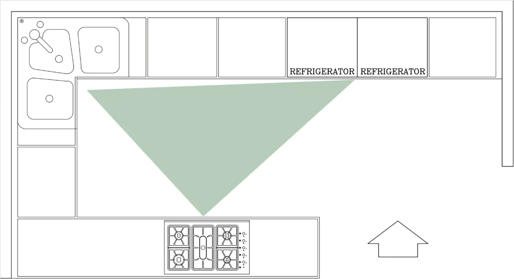
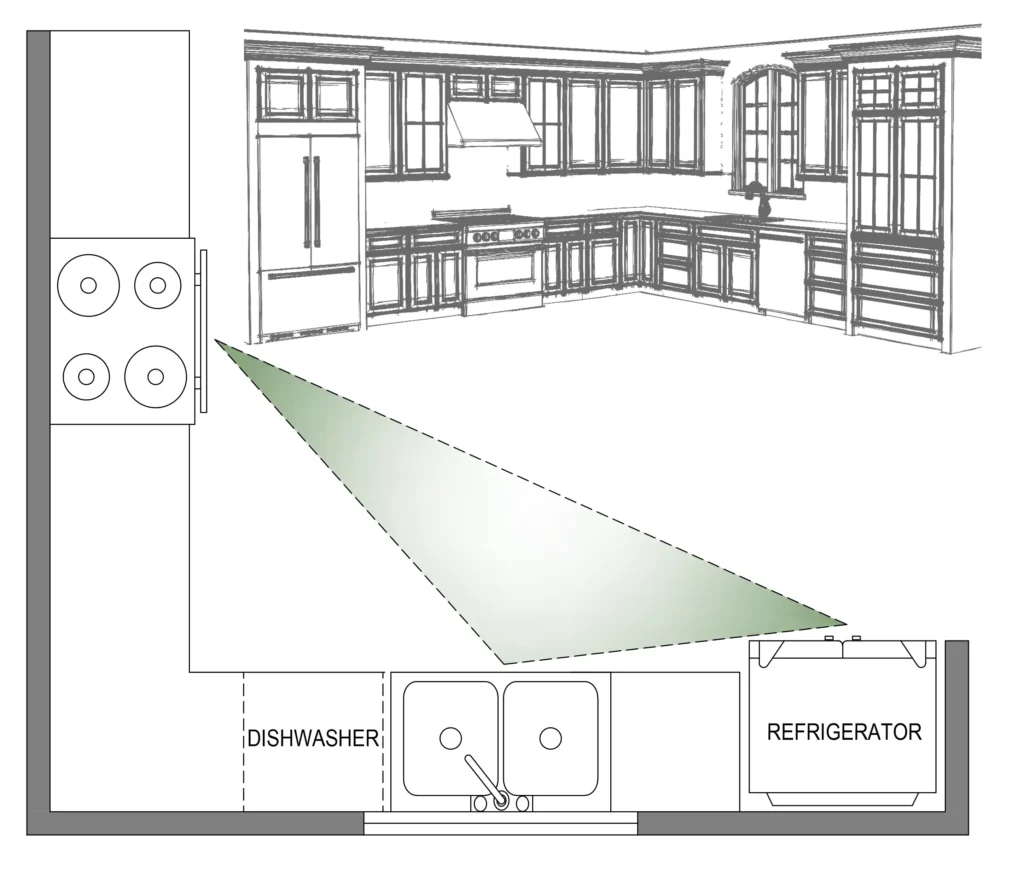
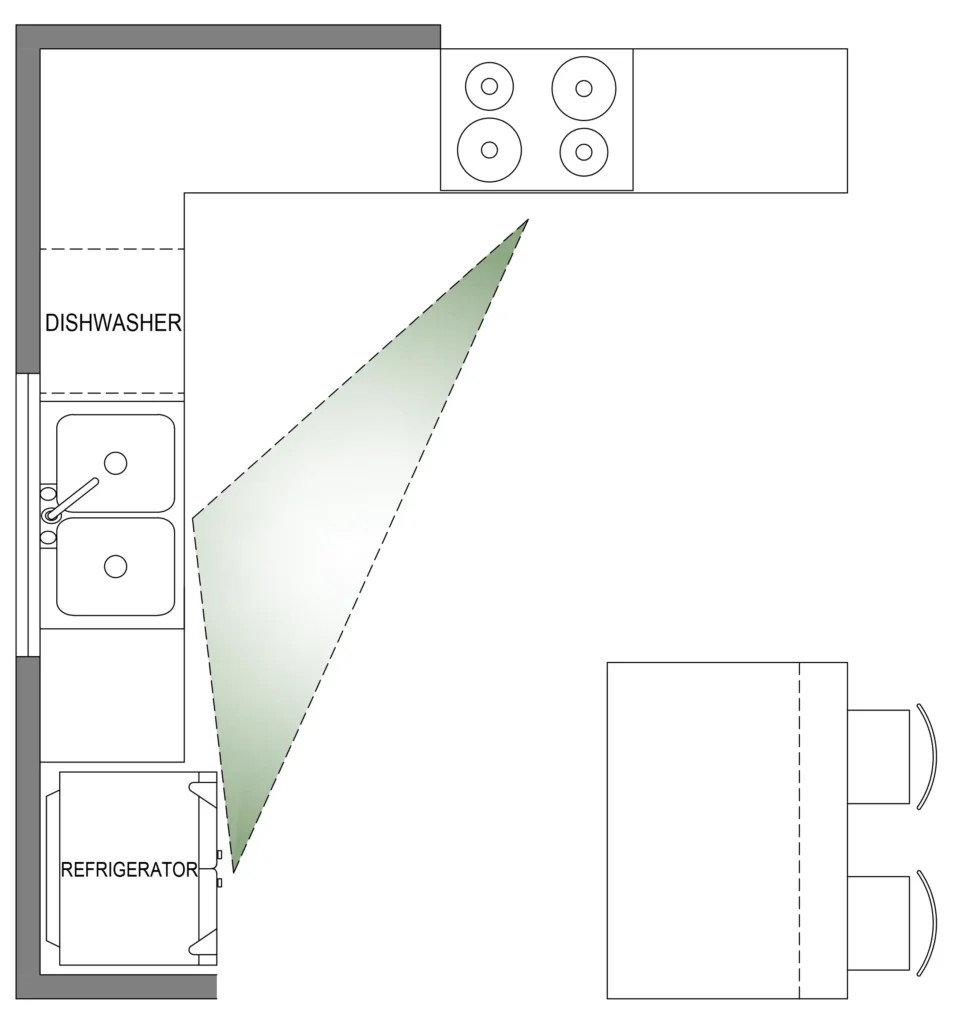
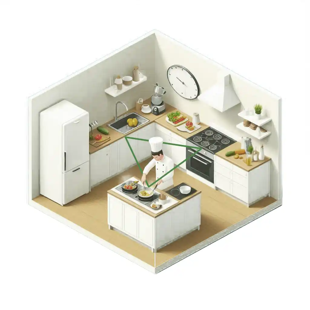
The work triangle is a fundamental concept in kitchen design. It’s the triangle formed by the stove, sink, and refrigerator.
No matter the configuration, most kitchens ideally incorporate the work triangle: the cook should be able to move easily between the refrigerator, oven, and sink in just a few steps—no more than four or five. The most critical connection is between the sink and the stovetop or range, and placing them on the same countertop is a significant advantage. While the work triangle is an excellent guideline, it’s not a strict rule. A designer who understands their cooking style can opt for a layout better suited to their preferences.
Here are the basic standards for an ideal work triangle:
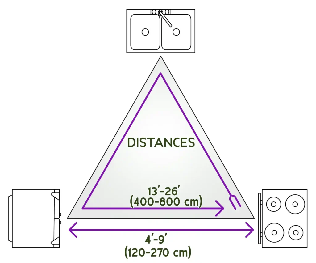
- Distance between points: The sides of the triangle should measure between 4 to 9 feet (120 to 270 cm). The total perimeter of the triangle should ideally fall between 13 to 26 feet (400 to 800 cm). This ensures each area is close enough for convenience but not so close that the space feels cramped.
- Unobstructed paths: The triangle should be free from obstructions like cabinets, islands, or large appliances. This keeps the flow between workstations smooth and efficient.
- Minimal traffic interference: Ideally, the work triangle should not intersect with major traffic routes in the kitchen to avoid congestion and ensure a smoother workflow.
By following these guidelines, the kitchen becomes more efficient. Tasks like food preparation, cooking, and cleanup all happen within a streamlined, functional layout.
When designing the kitchen work triangle, it’s essential to consider the placement of the stove and refrigerator to maintain efficiency and comfort:
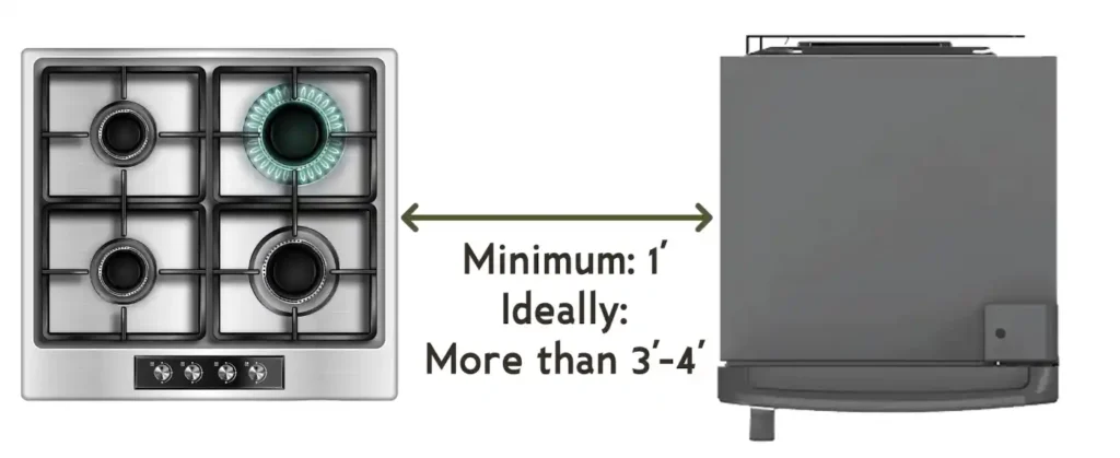
- Don’t place the stove too close to the refrigerator: The heat generated by the stove can negatively impact the refrigerator’s performance. Placing these appliances side by side forces the fridge to work harder to maintain its cool temperature, increasing energy consumption and reducing its lifespan. Keeping some distance between the stove and refrigerator ensures both appliances operate efficiently.
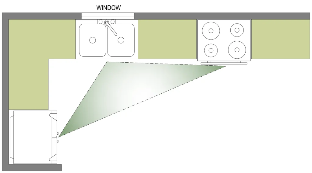
- Don’t position the stove or refrigerator in front of a window: Placing either appliance in front of a window can obstruct natural light, reducing visibility and creating glare, especially while cooking. It can also interfere with airflow or make opening and closing the window difficult. Keeping windows free of major appliances ensures better light distribution and ventilation in the kitchen.
Let’s design an L-shaped kitchen, which works great in many modern homes.
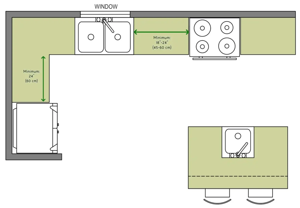
Using the symbols, we’ll position the stove on the longer side of the L, the sink near the window, and the refrigerator on the shorter side. Make sure the triangle isn’t too large or too small—it should feel natural.
Step 3: Plan Countertop and Prep Space
After establishing the work triangle, the next step is to focus on prep areas and determine the best placement for your work surfaces. Ideally, there should be a counter space adjacent to each key appliance. For instance, positioning countertops on both sides of the stove ensures easy access to ingredients, utensils, and cooking tools while preparing meals.
For ease of use and functionality, it is recommended that at least 18 to 24 inches (45 to 60 cm) of clear countertop space be provided on both sides of the cooktop and sink and at least 24 inches (60 cm) on one side of the refrigerator and built-in oven.
Use the symbols for lower cabinets and countertops to mark these areas. You can also add an island if space allows. The island is great for additional prep, storage, and seating.
Step 4: Storage and Cabinet Placement
Next, let’s add storage. Upper cabinets should be placed above the countertops and along the walls. Use symbols for the upper cabinets to indicate this. Lower cabinets go below the countertops and can include features like pull-out drawers, lazy Susans, or spice racks.
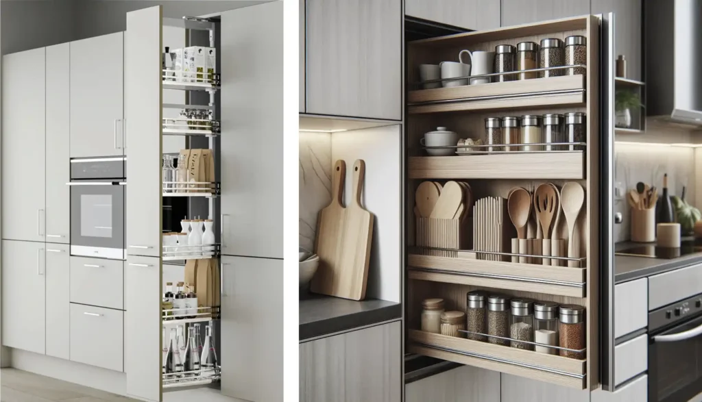
Pull-out larder units are recommended for efficient kitchen storage. They offer vertical space-saving solutions and easy access to content. They are ideal for narrow spaces or pantry storage, customizable in height and configuration, and help reduce kitchen clutter.
Optimize storage by planning around frequently used items. Pots and pans should be close to the stove, while cleaning supplies go under the sink.
Step 5: Add Appliances and Utilities
Now, it’s time to place additional appliances like the dishwasher, microwave, and oven. Mark these locations on the plan and section using the appropriate symbols.
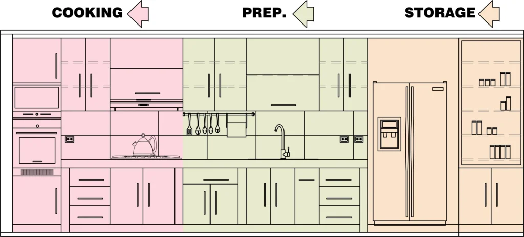
When planning prep space, ensure the countertop between the sink, range, and refrigerator is large enough for tasks like ingredient access, chopping, and mixing. The layout should support a smooth workflow between the kitchen’s key zones: storage, prep, and cooking.
Placing the dishwasher near the sink is efficient because they can share plumbing utilities. It also improves workflow by allowing easy transfer of rinsed dishes to the dishwasher, minimizing spills, and keeping the kitchen organized during cleanup.
In homes without a laundry room, incorporating a washing machine into the kitchen is a practical option. It’s often placed near plumbing, under the countertop with other appliances like the dishwasher or sink. Cabinetry can hide the machine, ensuring a seamless and tidy kitchen appearance.
Step 6: Finishing Touches
Finishing touches in kitchen layout design are crucial for tying the space together and enhancing both functionality and aesthetics.
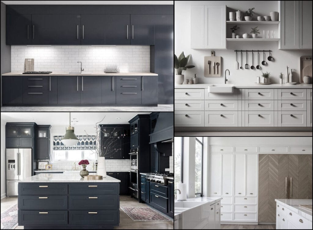
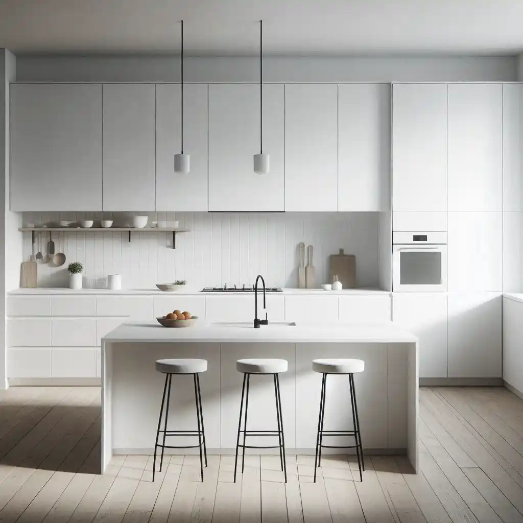
One key element in kitchen design is cabinet hardware, such as handles and knobs, which add both style and functionality. However, in minimalist kitchens, handles are often omitted in favor of sleek, handleless cabinets to maintain a clean, streamlined appearance.
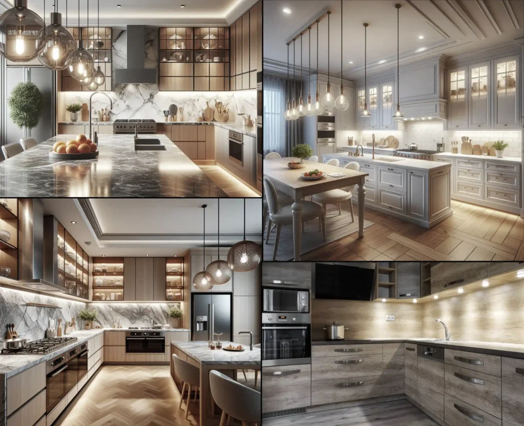
Additionally, lighting fixtures, both task and ambient, play an essential role in creating a welcoming atmosphere while ensuring the kitchen is well-lit for cooking and everyday activities. Overhead lighting should be placed strategically around the kitchen for both aesthetics and functionality. Consider under-cabinet lighting for better visibility on your work surfaces.
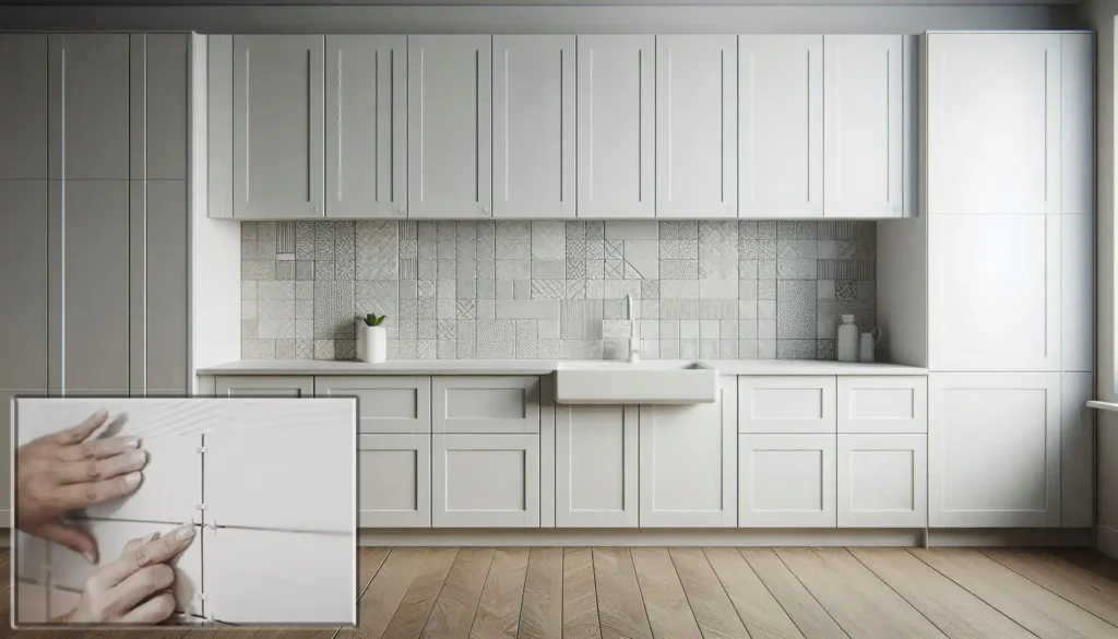
Backsplashes serve as a protective and decorative element, with materials like tile, stone, or glass adding texture and color.
Whether polished or matte, the choice of countertop finishes not only defines the visual appeal but also affects durability and maintenance.
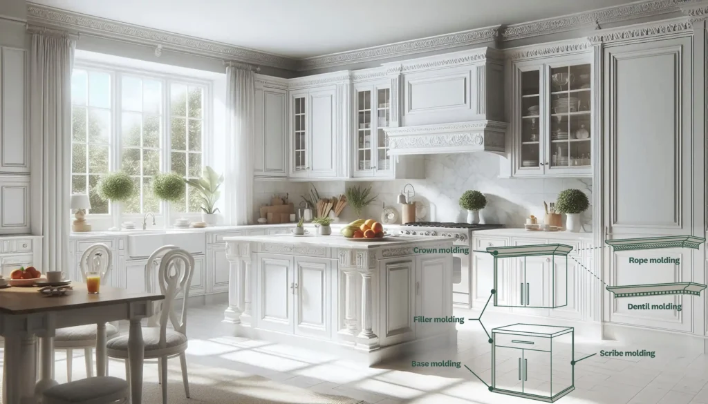
Moldings and trims around cabinets and countertops offer a refined look, while thoughtful details like integrated appliance panels can maintain a seamless appearance.
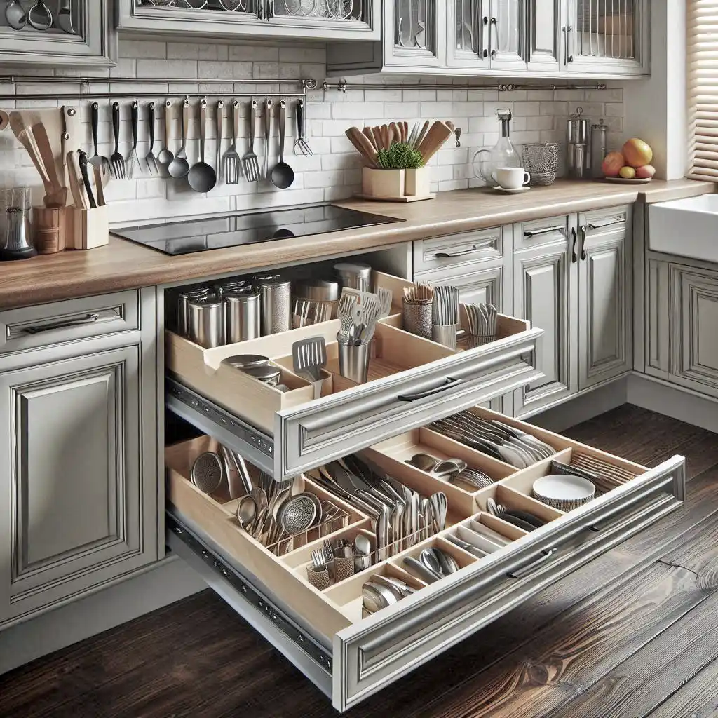
Lastly, accessories such as cutlery trays, pull-out shelves, and organizers inside cabinets enhance storage efficiency, ensuring the kitchen layout is as practical as it is beautiful. These finishing touches complete the design, effortlessly blending form and function.
KEY DIMENSIONS & STANDARDS
Designing a kitchen with the correct dimensions is key to creating a functional and comfortable space. Whether your layout is compact or expansive, following standard measurements ensures efficiency and smooth movement. In this section, we provide a quick glance at the essential kitchen design dimensions and standards to guide your planning.
- Standard counter height: 36 inches (91 cm)
- Standard counter depth: 24 to 25 inches (61 to 64 cm). If countertop appliances are plentiful, consider 30 inches (76 cm).
- Standard backsplash height: 4 to 6 inches (10 to 15 cm). A full-height backsplash from the counter to the underside of the upper cabinets is preferred.
- Height of a high counter: 42 to 48 inches (107 to 122 cm). Stools should be sized to leave 12 inches (30 cm) between the seat and the underside of the counter.
- Depth of a high counter overhang (to accommodate stools): 12 inches (30 cm)
- Maximum distance between the oven, refrigerator, and sink: no more than four or five steps between each appliance.
- Walkway Clearance: The walkway must be at least 36 inches (91 cm) wide for one-way traffic and 48 inches (122 cm) wide for two-way traffic.
- Minimum Clearance Between Countertops: Maintain at least 42 inches (107 cm) between opposing countertops or appliances to allow for efficient work-zone movement. A clearance of 48 inches (122 cm) is recommended for enhanced functionality.
- Toe Kick Height: To provide comfortable foot space under cabinets, the toe kick is typically 3.5 to 4 inches (9 to 10 cm) high.
- Toe Kick Depth: Around 3 inches (8 cm) deep for ease of standing close to countertops.
- Distance Between Upper and Bottom Cabinets: The recommended distance between the countertop and the bottom of the upper cabinets is 18 to 20 inches (46 to 51 cm), which provides enough workspace without feeling cramped.
- Upper Cabinet Depth: The standard depth is 12 inches (30 cm) to access stored items easily.
- Space Between Stove and Range Hood: To ensure proper ventilation, the space between the stove and the range hood should be a minimum of 24 inches (61 cm) for an electric stove and 30 inches (76 cm) for a gas stove.
- Sink Depth: Standard sink depth ranges from 8 to 10 inches (20 to 25 cm), depending on user preference and function.
- Dishwasher Clearance: Leave at least 21 inches (53 cm) of space in front of the dishwasher so that the door can open fully.
- Refrigerator Clearance: Allow a minimum of 36 inches (91 cm) of clearance in front of the refrigerator for doors to open comfortably.
- Island Clearance: Leave at least 42 to 48 inches (107 to 122 cm) of space between the island and surrounding counters or walls for kitchens with islands.
- Overhead Cabinet Height: Tall overhead cabinets should not be more than 72 to 84 inches (183 to 213 cm) above the floor to be accessible without a step stool.
- Microwave Placement: Position 15 inches (38 cm) above the countertop for safe and convenient use.
- Recommended Space for Dishwasher: Provide a depth of 24 inches (61 cm) and a width of 24 inches (61 cm) to fit standard dishwasher models and ensure proper installation and functionality.
- Recommended Space for Refrigerator: Allow a depth of 30 to 36 inches (76 to 91 cm) and a width of at least 36 inches (91 cm) to accommodate most refrigerator models and ensure adequate ventilation and door clearance.
- Socket Height: Install sockets 4 to 6 inches (10 to 15 cm) above the worktops for convenient access and optimal placement.
- Trash Bin Location: Position the trash bin near food prep areas and ensure at least 18 inches (46 cm) of clearance for opening.
WRAPPING UP
We’ve covered the journey from understanding kitchen layout symbols to creating a design that blends form and function. Remember that every space is unique when designing your kitchen layout, so don’t hesitate to tailor the design to fit your specific needs. The goal is to find the perfect balance between functionality and style, ensuring your kitchen works seamlessly and looks stunning.
Feel free to leave a comment if you have any questions or suggestions.

